Getting started with CSS Grid layout
One of my strongest areas of web development is Cascading Style Sheets more commonly referred in the web world as CSS. I have always been a visual person, and with CSS I can create a pallet on the web using code (when combined with HTML5). CSS has rapidly evolved over the last few years with technologies and frameworks such as SASS/SCSS and Bootstrap leading the way. Another major advancement to CSS recently is the new layout techniques using grid (Or CSS Grid as it is commonly referred as). In this post, I will expound on the basics of CSS grid and how it can help you to design and code a complex layout for various devices.
I've been using CSS since the old days when table layout was king (yes, that was the web dark ages). Back then CSS was mainly used to decorate table borders, set table headers and cell decoration and add background images. Advancements over time lead such CSS layout flexibility as floats and absolute positioning but those were less than ideal to code and could not perform as expected when testing on the various browsers (yea Internet Explorer (IE) would always let me down).
The evolution of CSS
CSS has changed quite a bit since those days evolving into a more fluid grid with frameworks such as Bootstrap and Foundation leading the way to responsive grid layouts which respond to various device widths for desktop, tablet, and mobile. CSS Grid Layout is a potential game-changer in that this framework provides two-dimensional layout without using floats, tables, the need for bloated HTML and CSS Grid can even act as the Batman to Flexbox's Robin (meaning they team well together).
CSS Grid nitty gritty
Instantiating CSS Grid Layout is easy and it's similar to instantiating CSS Flexbox. In your CSS simply type:
[programCount]
 .container{
 display:grid;
 }
If you want to create a three column grid in with this framework, you could add fractions of the free space available as follows:
 .container{
 display:grid;
 grid-template-columns: 1fr 1fr 1fr;
 }
You don't have to use fractions though. You can also use pixels, ems/rems or percentages.
To add spacing between columns you would simply add a grid gap width, like this:
 .container{
 display:grid;
 grid-template-columns: 20% 20% 20% 20%;
 grid-gap:20px;
 }
Another similarity between CSS grid and Flexbox is aligning items. The default is align-items stretch, but you can also align items to start or end.
You can span grid items over a container as follows:
 .header{
 grid-column:span 12;
 background-color:#000000;
 border:1px solid #cccccc;
}
Aligning grid items is similar to aligning items in Flexbox where you can align-self items to the start | end | center.
Justifying items is similar to aligning items. justify-items start | end | center
Here is an example of the output of the above CSS Grid code
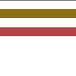
[wp_fancybox_media url="https://www.inspired-evolution.com/blog/wp-content/uploads/2018/10/CSS-Grid1.jpg" alt="CSS Grid template areas" type="image" hyperlink="View larger image"]
Grid Template Areas
Another interesting and powerful layout feature is grid template areas. Here is how that little CSS grid ditty goes.
HTML
 <div class="grid">
 <div class="item-1">Header</div>
 <div class="item-2">Main</div>
 <div class="item-3">Side</div>
 <div class="item-4">Footer</div>
</div>
CSS
 .grid{
 display: grid;
grid-template-columns: 1fr 1fr 1fr 2fr;
grid-template-rows: 100px 200px 100px;
grid-template-areas:
"head head . side"
"main main . side"
"footer footer footer footer";
color:#ffffff;
font-weight:bold;
text-align:center;
font-family:arial, helvetica, sans-serif;
}
.item-1{
grid-area:head;
background-color:#254e83;
padding-top:10px;
}
.item-2{
grid-area:main;
background-color:#25face;
padding-top:10px;
}
.item-3{
 grid-area:side;
 background-color:#c83905;
 padding-top:10px;
 }
 .item-4{
 grid-area:footer;
 background-color:#8c897a;
 padding-top:10px;
 }
This gives you the following layout.
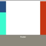
[wp_fancybox_media url="https://www.inspired-evolution.com/blog/wp-content/uploads/2018/10/CSS-Template-Areas.jpg" alt="CSS Grid template areas" type="image" hyperlink="View larger image"]
To break it down, with grid template areas you assign a grid areas in CSS such as header, side footer, main and declare that in CSS, then in your main grid class(.grid in this instance) you list out where you want these areas to display. In my example above you are indicating you want head two display for two columns then, with the (.) you are indicating you want a blank column space and then side in the fourth column. For the footer you are indicating you want that to expand all four columns.
CSS Grid is still pretty new and I am still in the process of grasping the concepts myself. I do know from what I have learned thus far CSS Grid is a very powerful and useful tool in web layouts and should grow in popularity as more and more developers use it for exciting and ground-breaking digital layouts.
Continued Learning
I recommend the following resources to further your CSS Grid training.
- A Book Apart - The new CSS Layout by Rachel Andrew
- CSS Tricks - A complete guide to CSS Grid
- CSS Grid Layout - Free Code Camp
I also recommend the following website to learn HTML
- Website Planet - Beginners Guide to HTML
Warning: Undefined array key "preview" in /home/s29q1k839k41/public_html/blog/wp-content/plugins/oxygen/component-framework/components/classes/comments-list.class.php on line 90
Warning: Undefined array key "preview" in /home/s29q1k839k41/public_html/blog/wp-content/plugins/oxygen/component-framework/components/classes/comments-list.class.php on line 113
Warning: Undefined array key "action" in /home/s29q1k839k41/public_html/blog/wp-content/plugins/oxygen/component-framework/components/classes/comments-list.class.php on line 113
Warning: Undefined array key "preview" in /home/s29q1k839k41/public_html/blog/wp-content/plugins/oxygen/component-framework/components/classes/comment-form.class.php on line 75
Leave a Reply
Warning: Undefined array key "preview" in /home/s29q1k839k41/public_html/blog/wp-content/plugins/oxygen/component-framework/components/classes/comment-form.class.php on line 79
Warning: Undefined array key "preview" in /home/s29q1k839k41/public_html/blog/wp-content/plugins/oxygen/component-framework/components/classes/comments-list.class.php on line 102